
There is a version of weekly planning that feels like admin: too many tabs, too many sharp edges, too much pressure to optimize every hour. Follow should feel different. The better version is quieter. You open one screen, see what still matters, decide what deserves energy, and move on with a clearer head.
This post is deliberately more about rhythm than meaning. The goal is to preview how a longer Follow story could look when the page breathes a little: a few paragraphs, a full-width visual, a compact gallery in the middle, then one more image before the close.

Start with one calm question
Instead of asking people to plan an ideal week, imagine Follow asking a smaller question: what would make the next few days feel lighter? That framing changes everything. You are no longer building a machine. You are arranging a little bit of clarity.
The first screen could show three simple cards: one for momentum, one for something overdue, and one for something kind. No noisy charts, no countdowns, no language that turns every unfinished task into a failure. Just a clear snapshot of where attention might go next.
This article is a layout demo for the journal. The illustrations are local placeholder assets, added specifically to preview image blocks and gallery spacing inside MDX.
A gallery in the middle of the story
Some ideas are better shown as a short sequence rather than one hero visual. A gallery lets the article change tempo for a moment. The reader gets four quick frames, each one hinting at a different state of the product, without forcing a full break in the narrative.
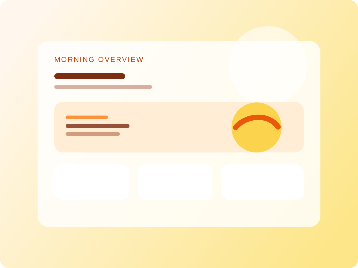
Morning overview

One clear focus
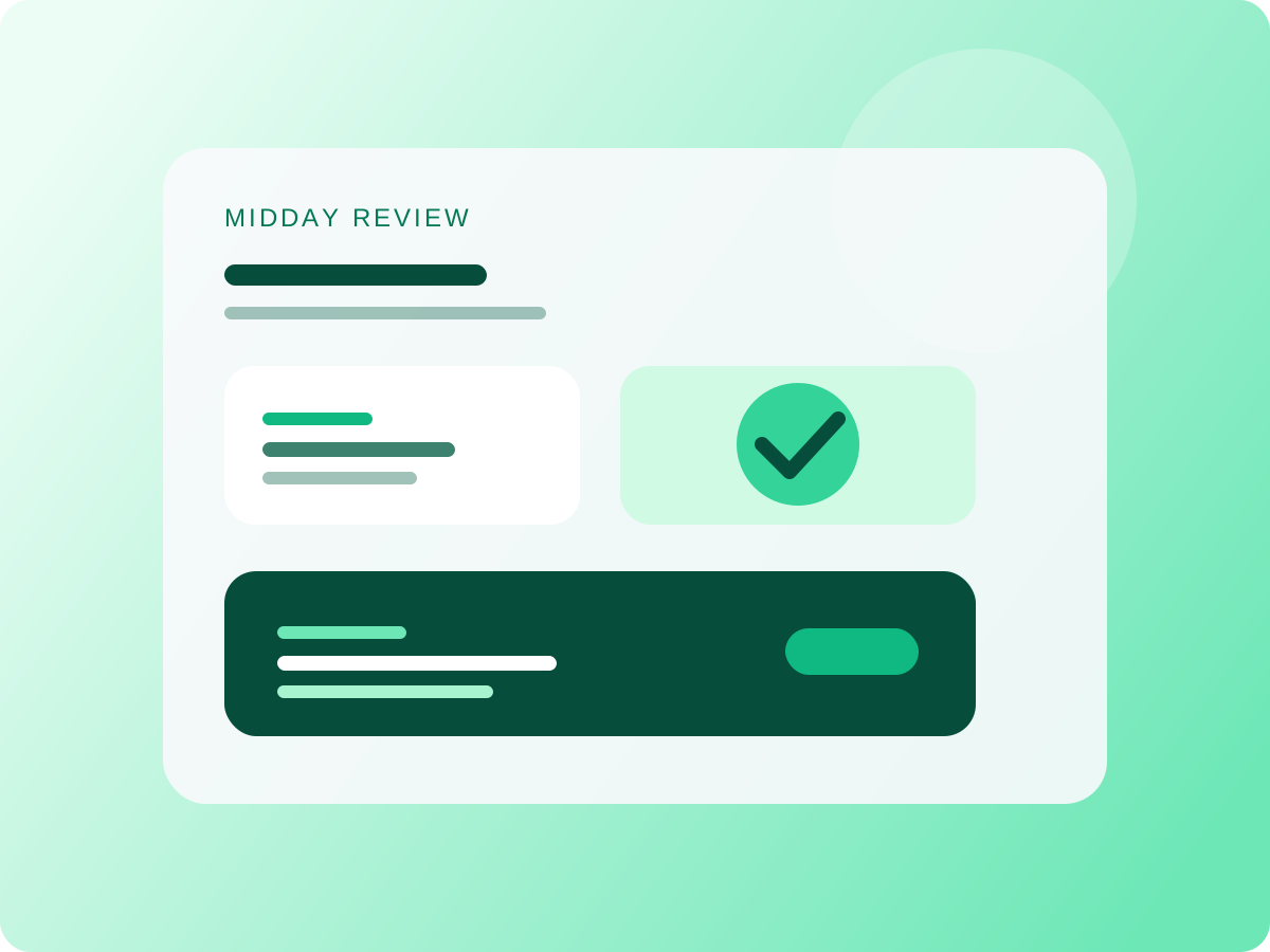
Midday review
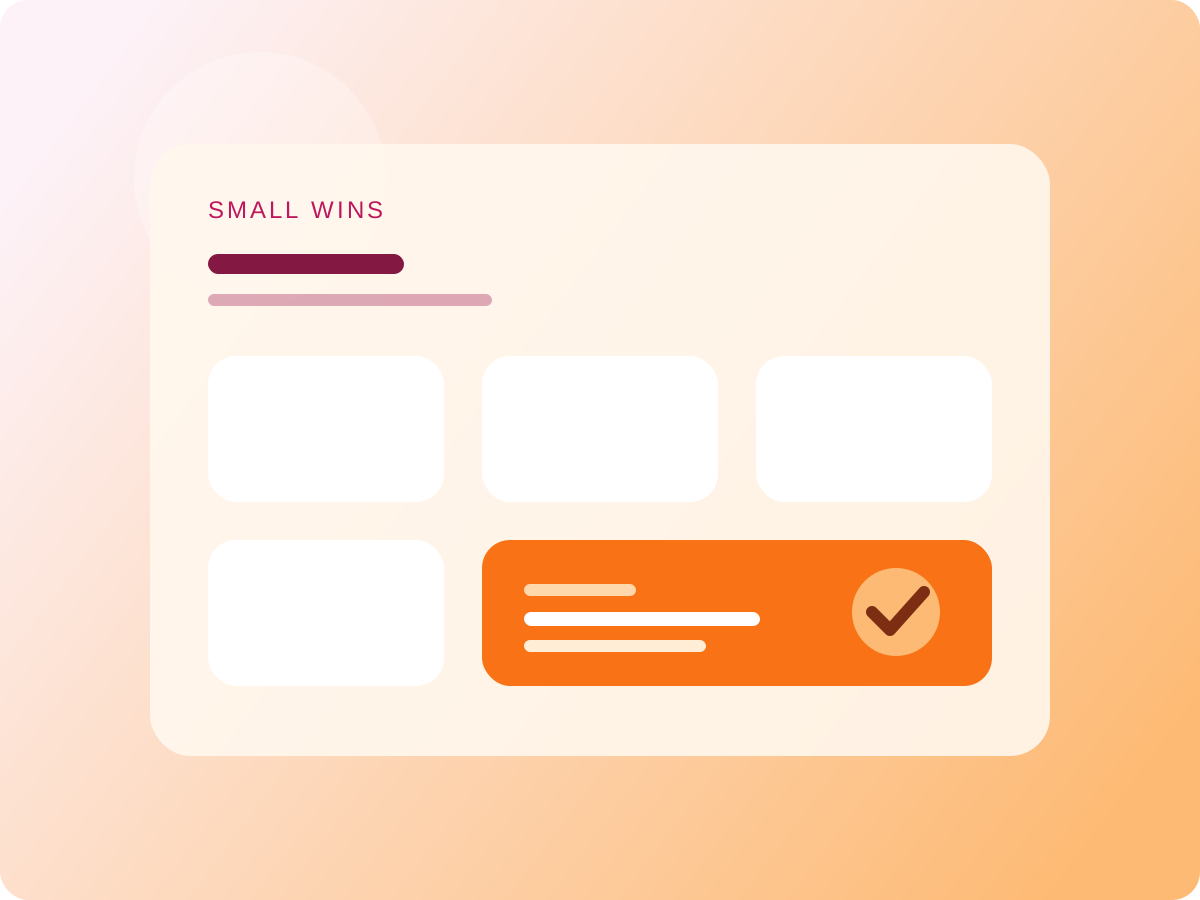
Small wins
A compact 2x2 gallery is useful when one idea is easier to read as a sequence of moments instead of a single image.
Another gallery pattern: one main frame and a filmstrip
If the grid feels too catalog-like, a second pattern is a showcase block with one dominant image, simple next and previous controls, and a horizontal strip of previews underneath. It gives the page a more editorial rhythm because the reader focuses on one frame at a time instead of scanning four cards at once.
End on a wider frame
After a gallery, one more large image gives the page weight again. It resets the cadence and helps the closing section feel intentional rather than abrupt. For a product journal, that is useful: screenshots or illustrations can do structural work, not just decorative work.

Why this matters for Follow
If Follow is meant to feel calm, the journal around it should feel calm too. That means generous spacing, visuals with room to breathe, and content blocks that guide attention without shouting for it.
For now the copy can stay lightweight. The useful part is the composition: headline, intro, single image, sequence gallery, single image again, and a short close. That is enough to test how the blog behaves before the meaning of the article needs to become sharper.